Bar Graphs and Histograms
Table of Contents
- Creating a bar graph with one independent variable
- Creating a bar graph with two independent variables
- Adjusting bar spacing
- Introduction to histograms
- Using the FREQUENCY function
- Creating a histogram
Introduction
Bar graphs are created in much the same way scatter
plots and line graphs are. Histograms are a specialized type of bar
graph used to summarize groups of data.
Creating a bar graph with one independent variable
Data is entered into Excel much in the same way
as it is with scatter plots and line graphs:
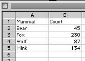
Note that the independent variable is
placed in the first column while the dependent variable is
placed in the second column. The headers at the top of each column are
not necessary, but they do help identify the variables.
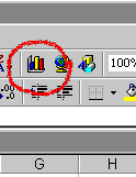
With the data shown above highlighted,
start the Chart Wizard from the toolbar:
If the Chart Wizard is not visible on the toolbar,
you can also choose Insert > Chart...
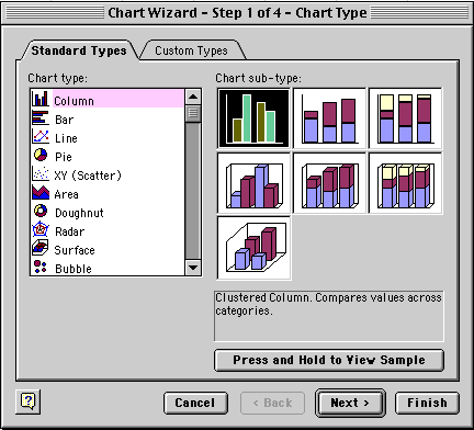
Choose the Column Chart type and the Chart
sub-type in the upper left corner (basic bar graph). This
chart type creates a vertical bar graph, which Excel refers to as a
Column chart. If you want to create a horizontal bar graph, choose the
Bar chart type. Click Next when you are done.
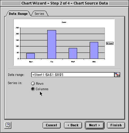
Confirm that your Data Series are in Columns
in your spreadsheet. Your Data range should reflect your selection
of the independent and dependent data (plus possibly your column headers)
in absolute cell references. The preview should show a pretty
good representation of what your chart will look like. Click Next
when you are done.
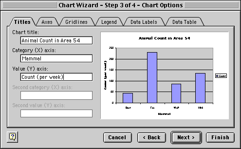
Enter your titling. Also make sure to go to the
Legend tab and click off the Show Legend option.
You will not need a legend with only one independent variable. Click
Next or Finish when you are done.
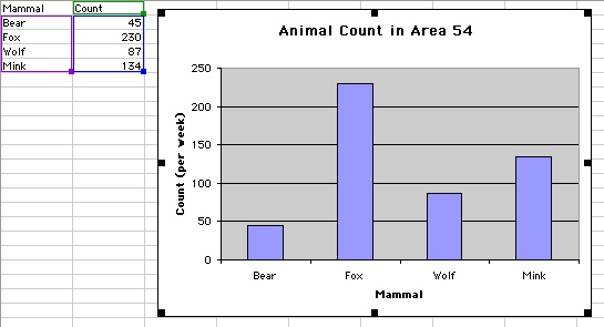
Your final graph should look something like the
one above. Note that when the graph is selected, your independent and
dependent variables are highlighted in purple and blue boxes, respectively.
Return
to Top
Creating a bar graph with two independent variables
A multiple bar graph depicting data using two
independent variables is created in the same way as a simple bar graph:
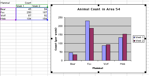
Some things to note when creating this multiple
bar graph:
- The first independent variable, Mammal, is still in the
first column, with the dependent variable values (Count)
in columns two and three. The second and third columns represent dependent
variable values at two different levels of the second independent
variable, Week.
- Make sure to select all of the data when creating the graph. The
Chart wizard will automatically recognize you have a second independent
variable.
- When you get to the last step of the Chart wizard, keep the legend
turned on, since it shows the coding for the two
levels of the second independent variable.
Return
to Top
Adjusting bar spacing
The relative widths of bars to the gap between
the bars can be adjusted by double-clicking on one of the bars
in the graph:
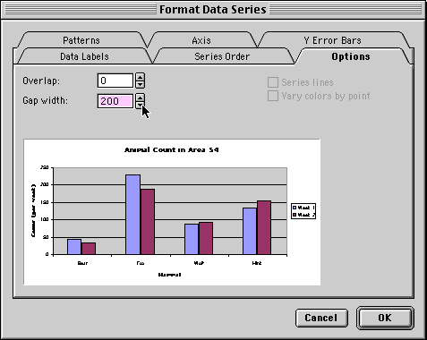
- Gap width represents the spacing between bars as a percentage
of the width of one bar
- Overlap will overlap bars in group as a percentage of bar
width. Negative values creates a gap between the bars within a group.
Return
to Top
Introduction to histograms
In some investigations, you may find yourself
collecting a large number of data points for a single level of an independent
variable. That is, you take the same measurement over and over again.
You would do this because a lack of perfect precision in your measuring
process would not let you get a good estimate of the true value with
only a single measurement. In this example, the fracture stress of a
certain type of glass bar is measured 24 times:
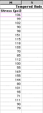
Clearly, the measured stress is not the same for
each sample. In fact, the measurements range from a low of 55 to a high
of 169. How can you summarize the results of these measurements? One
way might be to simply calculate the average (mean) of all these measurements.
This would not, however, give you a good feel for how the data is distributed.
A distribution graph, or histogram, allows you to see how
many measurements fall within set ranges, or bins, of the dependent
variable. A histogram is usually depicted as a bar chart, with one bar
representing the count of how many measurements fall with a single bin.
Return
to Top
Histograms - using the FREQUENCY function
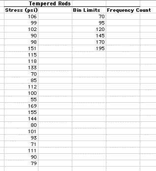
To start with, it is usually a good idea to scan
your data and get a feel for its overall range. For the data above,
the range is from 55 to 169. Next you will want to decide how fine you
want the increment of your bins. The finer the increment, the more bins,
and thus the more bars on your chart. For this example we will choose
a bin increment of 15 starting with 70. Depending on what you want to
depict, you may want to show an empty bin above and/or below the extreme
values of your samples to show the viewer that you are at the extremes
of your data set. Type in these bin increments in a column next to your
raw data:
Though you can manually count the number of measurements
that fall within each of these bins, an easier way is to use the Excel
function FREQUENCY. This function is a bit more complex than
functions such as MEAN. The FREQUENCY function is an array function,
returning values to a range of cells. Look at the figure below and follow
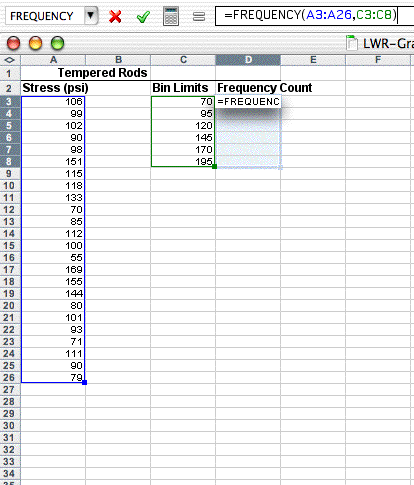
the steps to enter this function:
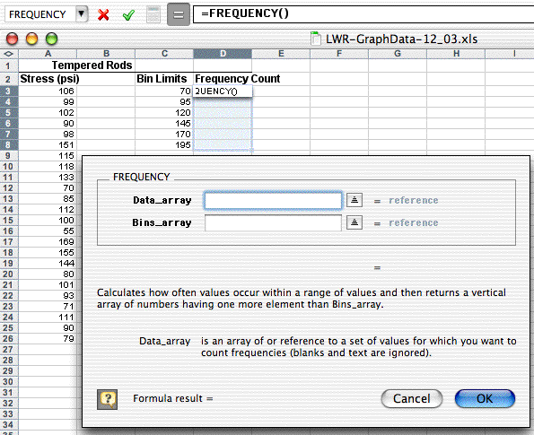
- Highlight the range of cells which will hold the frequency
counts (D3:D8). These will be all of the Frequency
Count cells next to the bin increments.
- Choose Insert>Function..., pick the Statistical
Function category and scroll down in the
box on the right and choose FREQUENCY as the Function
name.
- Use the dialogue box to enter the function. With the Data_array
box selected, go to the spreadsheet page and highlight
the data values (A3:A26). The dialogue box with "roll
up" while you highlight these values and then "roll down"
when you are done.
- Repeat this process by selecting the Bins_array
box and then go out the spreadsheet and highlight
the bin limits cells (C3:C8).
- Click OK. The completed formula is seen in the formula bar and the
correct count value is seen in the Bin Limit 70 count cell (D3):
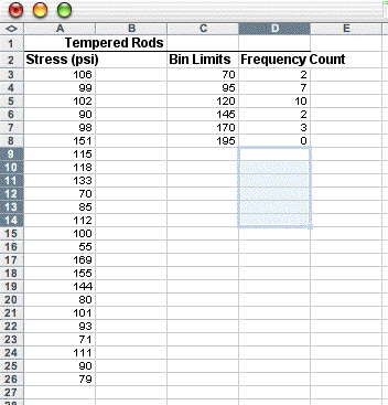
What has not been done yet is to copy the array function down to the
other Frequency Count cells. This is a bit different that typical cell
copying:
- With the Frequency Count cells still highlighted (D3:D8),
click on the FREQUENCY function
into the formula bar (i.e., =FREQUENCY(A3:A26,C3:C8))
- Propagate the function by typing Control-Shift-Enter
on a PC (type Command-Return on the Mac).
The frequency values should now fill the cells
next to the bin increments. Note that your first bin increment, 70,
holds all the measurements at 70 and below. The next bin, 95, holds
measurements from 71-95, and so on. The result should look like this:
If only the top cell is filled with a frequency
value, then you probably either didn't highlight the range of cells
next to the bin increments, or you didn't use the special key combination
to enter the function. Note that in the next figure, the last bin value,
195, was changed to More to indicate in the graph that
it represents the count for everything above 170.
Return
to Top
Creating a histogram
You can now create a bar graph as you did above
using the histogram summary data rather than the raw data:
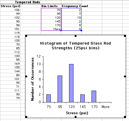
Note again that this histogram is made from the
summary data (highlighted in purple and blue boxes), not the raw data.
Optionally you can leave the More category from the graph.
Just as you can with other data, you can create
a multiple bar histogram. You can either do this as was shown above
or by superimposing two histograms (see the Advanced module on
superimposing graphs).
Return
to Top
|