Linear Regression in Excel
Table of Contents
- Create an initial scatter plot
- Creating a linear regression line (trendline)
- Using the regression equation to calculate slope and
intercept
- Using the R-squared coefficient calculation to estimate
fit
Introduction
Regression lines can be used as a way of visually depicting the relationship
between the independent (x) and dependent (y) variables in the graph.
A straight line depicts a linear trend in the data (i.e., the equation
describing the line is of first order. For example, y = 3x + 4. There
are no squared or cubed variables in this equation). A curved line represents
a trend described by a higher order equation (e.g., y = 2x2
+ 5x - 8). It is important that you are able to defend your use of either
a straight or curved regression line. That is, the theory underlying your
lab should indicate whether the relationship of the independent and dependent
variables should be linear or non-linear.
In addition to visually depicting the trend in the data with a regression
line, you can also calculate the equation of the regression line. This
equation can either be seen in a dialogue box and/or shown on your graph.
How well this equation describes the data (the 'fit'), is expressed as
a correlation coefficient, R2 (R-squared). The closer R2
is to 1.00, the better the fit. This too can be calculated and displayed
in the graph.
The data below was first introduced in the basic
graphing module and is from a chemistry lab investigating light absorption
by solutions. Beer's Law states that there is a linear relationship between
concentration of a colored compound in solution and the light absorption
of the solution. This fact can be used to calculate the concentration
of unknown solutions, given their absorption readings. This is done by
fitting a linear regression line to the collected data.
Creating an initial scatter plot
Before you can create a regression line, a graph must be produced from
the data. Traditionally, this would be a scatter plot. This module will
start with the scatter plot created in the basic
graphing module.
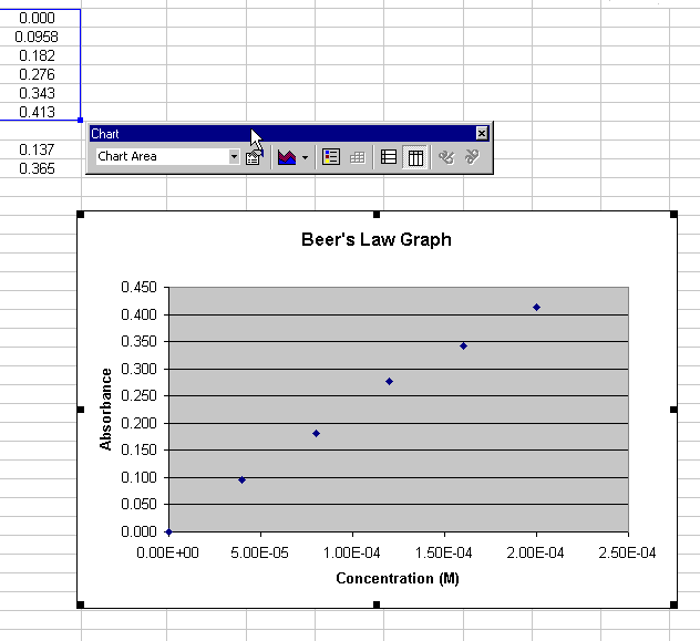
Figure 1.
Return to Top
Creating a Linear Regression Line (Trendline)
When the chart window is highlighted, you can add a regression line to
the chart by choosing Chart > Add trendline...
A dialogue box appears (Figure 2). Select the Linear Trend/Regression
type:
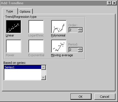
Figure 2.
Choose the Options tab and select Display equation on chart
(Figure 3):
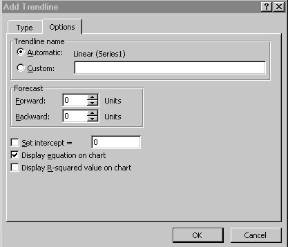
Figure 3.
Click OK to close the dialogue. The chart now displays the regression
line (Figure 4)
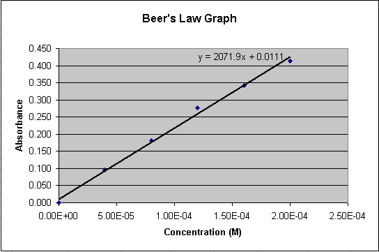
Figure 4.
Return to Top
Using the Regression Equation to Calculate Concentrations
The linear equation shown on the chart represents the relationship between
Concentration (x) and Absorbance (y) for the compound in solution. The
regression line can be considered an acceptable estimation of the true
relationship between concentration and absorbance. We have been given
the absorbance readings for two solutions of unknown concentration.
Using the linear equation (labeled A in Figure 5), a spreadsheet cell
can have an equation associated with it to do the calculation for us.
We have a value for y (Absorbance) and need to solve for x (Concentration).
Below are the algebraic equations working out this calculation:
y = 2071.9x + 0.111
y - 0.0111 = 2071.9x
(y - 0.0111) / 2071.9 = x
Now we have to convert this final equation into an equation in a spreadsheet
cell. The equation associated with the spreadsheet cell will look like
what is labeled C in Figure 8. 'B12' in the equation represents y (the
absorbance of the unknown). The solution for x (Concentration) is then
displayed in cell 'C12'.
- Highlight a spreadsheet cell to hold 'x', the result of the
final equation (cell C12, labeled B in Figure 5).
- Click in the equation area (labeled C, figure 5)
- Type an equal sign and then a parentheses
- Click in the cell representing 'y' in your equation (cell B12
in Figure 5) to put this cell label in your equation
- Finish typing your equation
Note: If your equation differs for the one in this example, use your
equation
Duplicate your equation for the other unknown.
- Highlight the original equation cell (C12 in Figure 5) and
the cell below it (C13)
- Choose Edit > Fill > Down
Return to Top
Note that if you highlight your new equation in C13, the reference to
cell B12 has also incremented to cell B13.
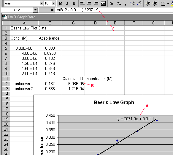
Figure 5.
Return to Top
Using the R-squared coefficient calculation to estimate
fit
Double-click on the trendline, choose the Options tab in
the Format Trendlines dialogue box, and check the Display r-squared
value on chart box. Your graph should now look like Figure 6. Note
the value of R-squared on the graph. The closer to 1.0, the better the
fit of the regression line. That is, the closer the line passes through
all of the points.
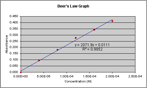
Figure 6.
Now lets look at another set of data done for this lab (Figure 7). Notice
that the equation for the regression line is different than is was in
Figure 6. A different equation would calculate a different concentration
for the two unknowns. Which regression line better represents the 'true'
relationship between absorption and concentration? Look at how closely
the regression line passes through the points in Figure 7. Does it seem
to 'fit' as well as it does in Figure 6? No, and the R-squared value confirms
this. It is 0.873 in Figure 7 compared to 0.995 in Figure 6. Though we
would need to take in to account information such as the number of data
points collected to make an accurate statistical prediction as to how
well the regression line represents the true relationship, we can generally
say that Figure 6 represents a better representation of the relationship
of absorption and concentration.
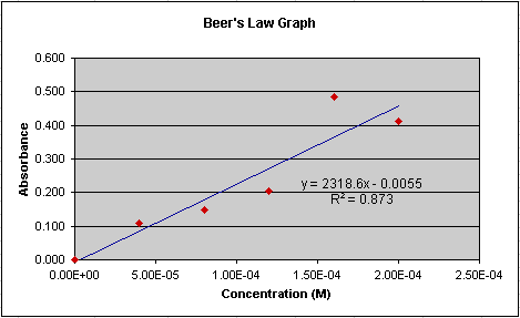
Figure 7.
Return to Top
|