PreLab: Sketching a Graph of Your
Hypothesis
Now that you have formed a hypothesis concerning relationship of the
independent variable(s) and dependent variable, it might be a good idea
to sketch out what this relationship might be. These sketches can be on
grid or plain paper. They should only take a minute to draw. Notice in
the examples below that no tick marks are measured out on scales nor are
specific points plotted on the graph. The graph's purpose is to express
a rough idea of what you think the trend in the data will be.
The first decision you need to make is whether you think there is a relationship
between the variable or not. That is, will changes in the value of the
independent variable affect the value of the dependent variable? If you
think there is a relationship, then the next decision may be to decide
whether this relationship is linear or governed by a higher order (curved)
relationship.
No Relationship
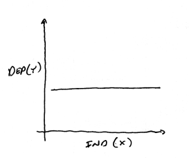
If you think there
is no relationship, then changes in value of the independent (x) variable
will not affect the value of the dependent variable. The dependent
variable value might be zero, a constant positive value, or constant negative
value. It might be that there are other factors/variables that affect
the dependent variable values, but it will be up to you to rule these
out.
Linear Relationships
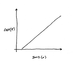
Another possibility
is that you have hypothesized a linear relationship between the independent
and dependent variables. If there is a positive relationship, then
increases in the independent variable would lead to a proportional increase
in the dependent variable. Your graph might look like the one above.
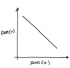
If you think that
there will be a negative relationship between the variables, then
increases in the independent variable will lead to decreases in
the dependent variable. Your graph might look like the one above.
Higher Order (curved)
Relationship
If you
think that there is a higher order relationship (e.g., the dependent variable
increases with the square of the independent variable increase) between
the independent and dependent variables, then you will need to express
the relationship in the graph as a curve. The exact shape of the curve
will depend on the mathematical relationship between the variables, but
there are a few basic curve shapes.
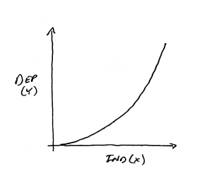
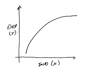
With
this shaped curve, positive increases in the independent variable
lead to increasingly larger growth in the dependent variable. The
curve may or may not get to the point that the curve is essentially vertical.
At this point the curve would express that an infinitesimally small increase
in X will lead to an infinitely large increase in Y. A curve that approaches
vertical but never gets there is said to be asymptotic.
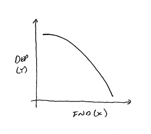
Another possibility
is the reverse of the previously situation. Here increases in the
independent variable lead to increasingly larger decreases in the
dependent variable.
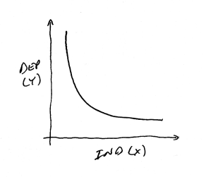
Another
common type of asymptotic curve is one where the independent variable
as less and less of an effect on the dependent variable. In this case
the curve becomes closer and closer to horizontal as the independent
variable gets larger, as it does above.
The reverse could
also be true. In the curve above, as the independent variable grows,
the dependent variable decreases less and less as it approaches
a constant Y value.
Next Step
If you have more than one independent variable you have
the choice of sketching multiple graphs for each pair of independent and
dependent variable, or sketching all the lines on a single graph. In this
case you will have to label or code the individual lines. Both approaches
have their merits. In the first case, you can focus in on each pairing
of variables. In the latter case, you can see the relationship of the
curves to each other as the independent variables are changed.
With a graph or graphs sketched out, you can begin to
collect data from the lab with some prediction of how you think the data
will map onto a graph. It is important that you don't attempt to manipulate
the data you collect to fit some predefined line. Rather, this pre-graphing
exercise helps further cement in your mind what you think the implications
your hypothesis are to the data you are about to collect.
|